Ahh, online shopping. I would say that it’s my latest ‘hobby’, but the more accurate term is “addiction”. I have spent the last three weeks burning so much of my money in online shops that I had to give myself a one-month ban on online shopping (unless I really need to or if the product is on sale). I could go on defending my impulsive and irresponsible tendencies but that’s for another post not what I’m really here for.
I’m here to rave about BeautyMNL, and to rant about Sephora PH. Not about their products or their service (I’m sure both are stellar), but about their websites. Spoiler alert: BeautyMNL wins almost all the rounds because I love that website so darn much.
Round 1: The Homepage (is where the heart is, bleh-heh)
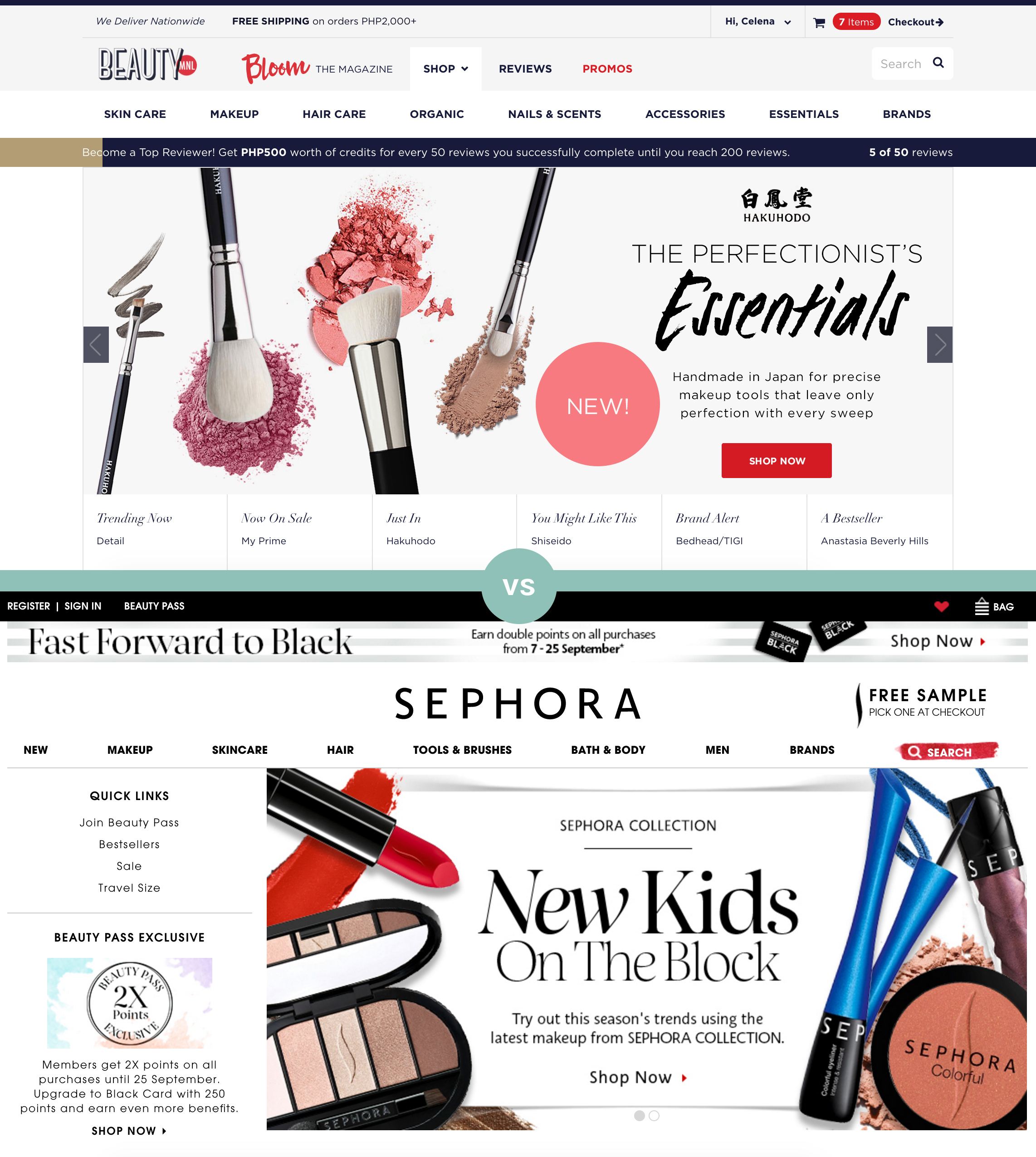
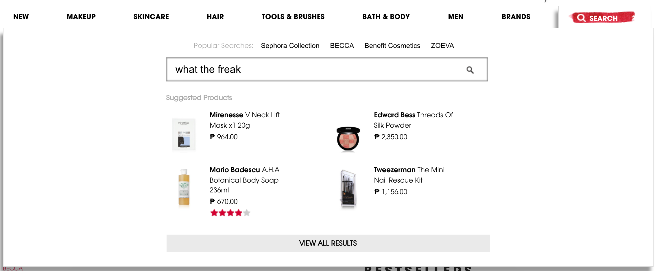
It’s understandable to want to have as many information in the homepage as possible, especially if it’s an e-commerce website. But it is evident that Sephora can learn a thing or two about simplicity. I am personally irked by that “Fast Forward to Black” banner at the top. As well as with their Search bar which isn’t really a search bar. You hover your mouse on it, and this appears:
The call-to-action buttons in their banners are also worth noting. BeautyMNL’s CTA is in a clear and direct red button, while Sephora’s CTA blends too much to the design.
Winner: (surprise!) BeautyMNL